A significant space
It was moving, uplifting, and .... reassuring. It combined intimacy of experience with monumental civic statement, and just seemed so right in so many ways.
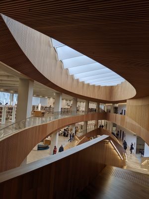
Organized as a set of curved spaces around a central eye-shaped atrium, it conveyed both spaciousness and focus; it fitted a lot in without being crowded. Warm wood, raw concrete and white walls were complemented by splashes of color on floors, furniture, beautiful and effective signage, bright doors. It had an organic and aesthetic unity that flowed naturally from the design.
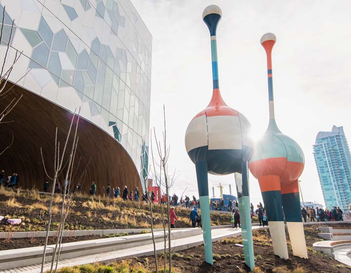
A honeycomb/hexagonal motif ran through the building, again providing variation within continuity.
It opened out onto the city, bringing in light and views, but it also had an enclosed and private feel, a place where you could be unobserved (indeed, I tried to avoid taking pictures of people, as it seemed wrong to step on this right to be unobserved). The range of services was delightful, and I mean delight-full, and wonderfully presented.
I loved the reader recommendations under 4 Ps (place, prose, plot, people - Nancy Pearl?). There were areas for newcomers (immigrants) and job seekers; meeting rooms (I thought there might be more); a maker space; a beautiful, bright engaging children's area and an area restricted to teens; a hip coffee shop; a lovely auditorium. There were spaces for quiet study (including a very nice and deliberately retro reading room on the upper floor) and extensive banks of PCs. However, despite extensive provision, because of the shape of the building the PCs did not crowd out books, or other areas, or come to dominate the view.

Gloriously, I thought, there was a great expanse of books and related materials, filling the curved spaces in bright, well signed, spaced out shelving. In central areas there was a Create Space, a space designed to be interactive and to engage library visitors in dialog about issues (there was an intriguing set of exercises around information and misinformation while I was there), and an art space. I have only had a quick look at the website, but I love that the visual identity of the library and the physical appearance of the building mesh so nicely. The library logo is wonderful and echoes a central design element.
Background

The library was designed by a partnership involving Snohetta, who have designed several landmark libraries in recent years. I was interested to read that indeed there was a 'fun to serious' motif with lower floors being more active and the reading room occupying the top. It is also built over a light railway line.
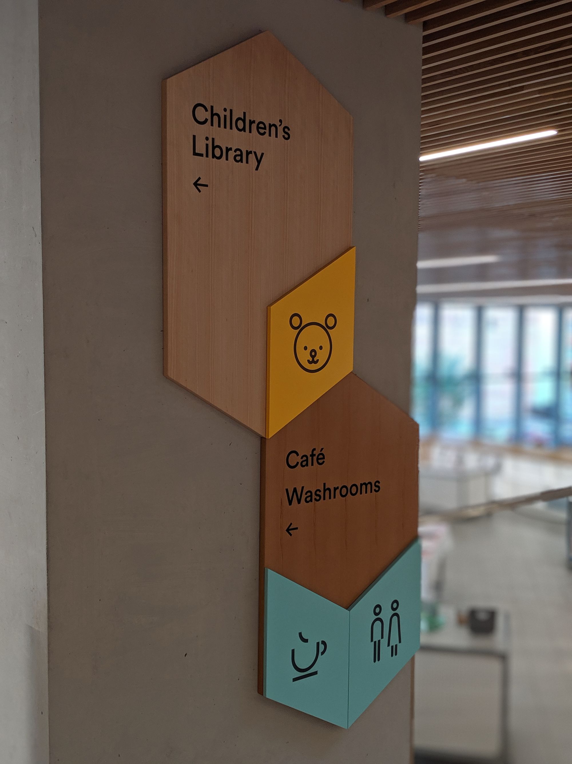
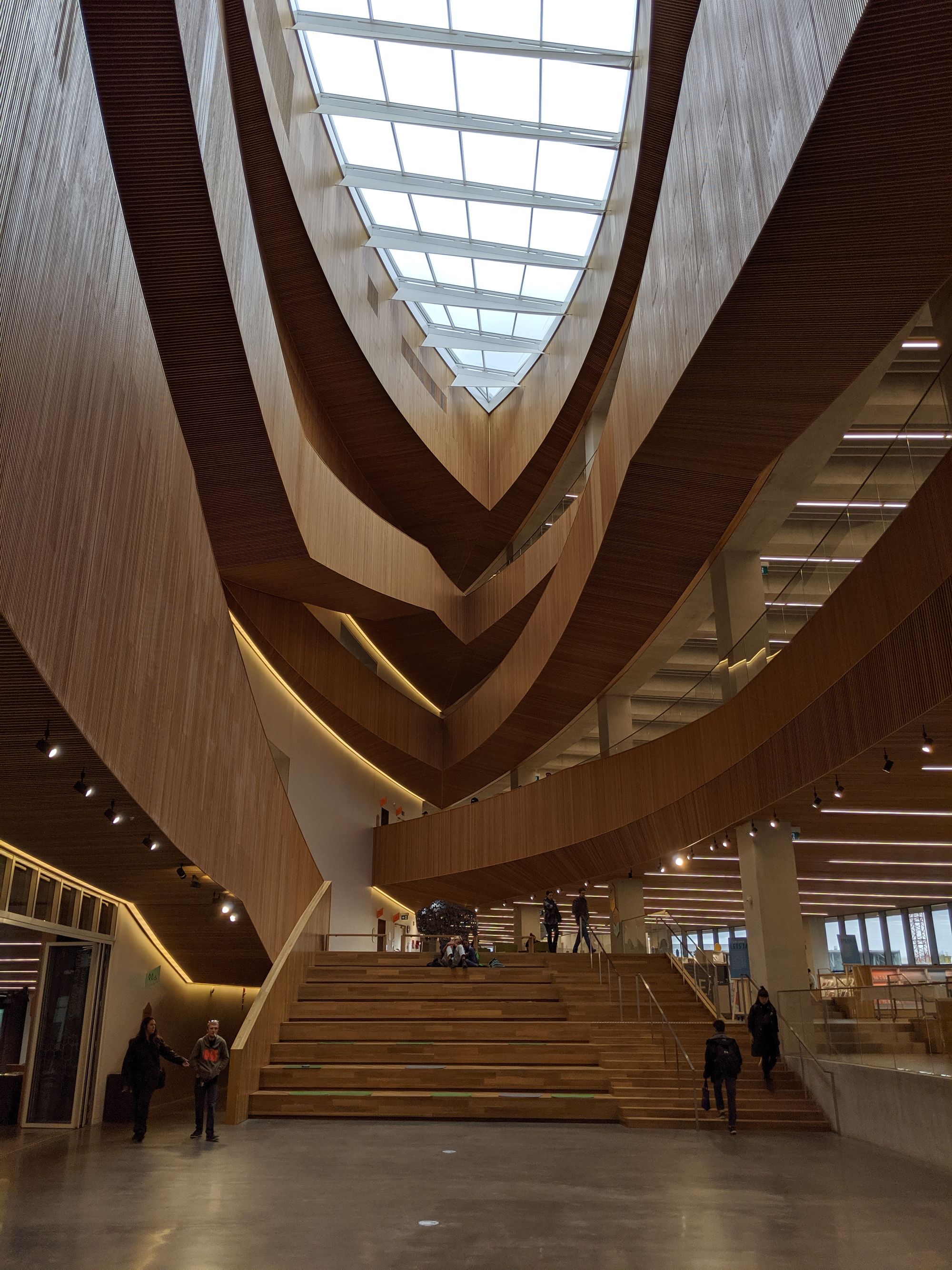
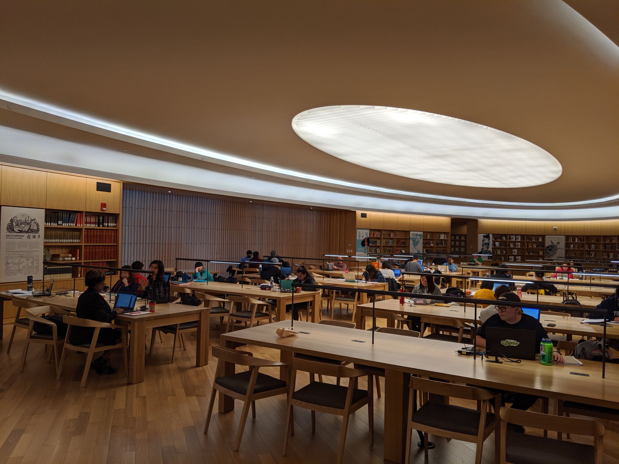
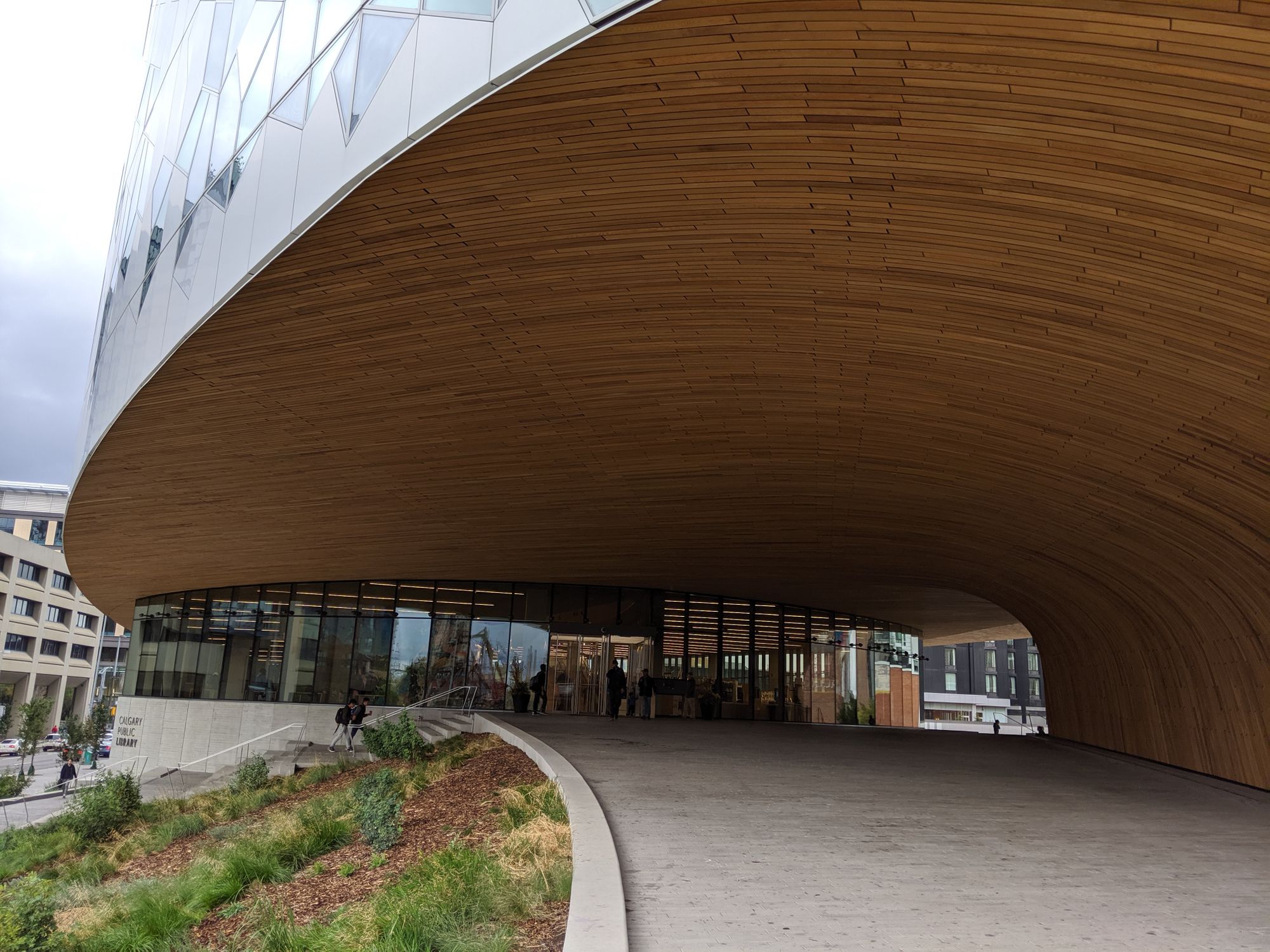
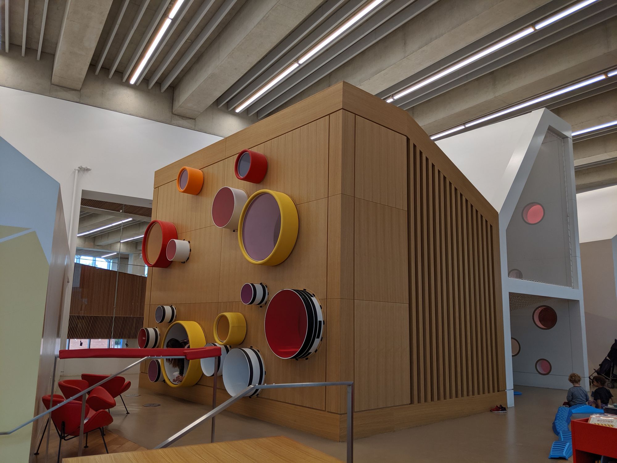
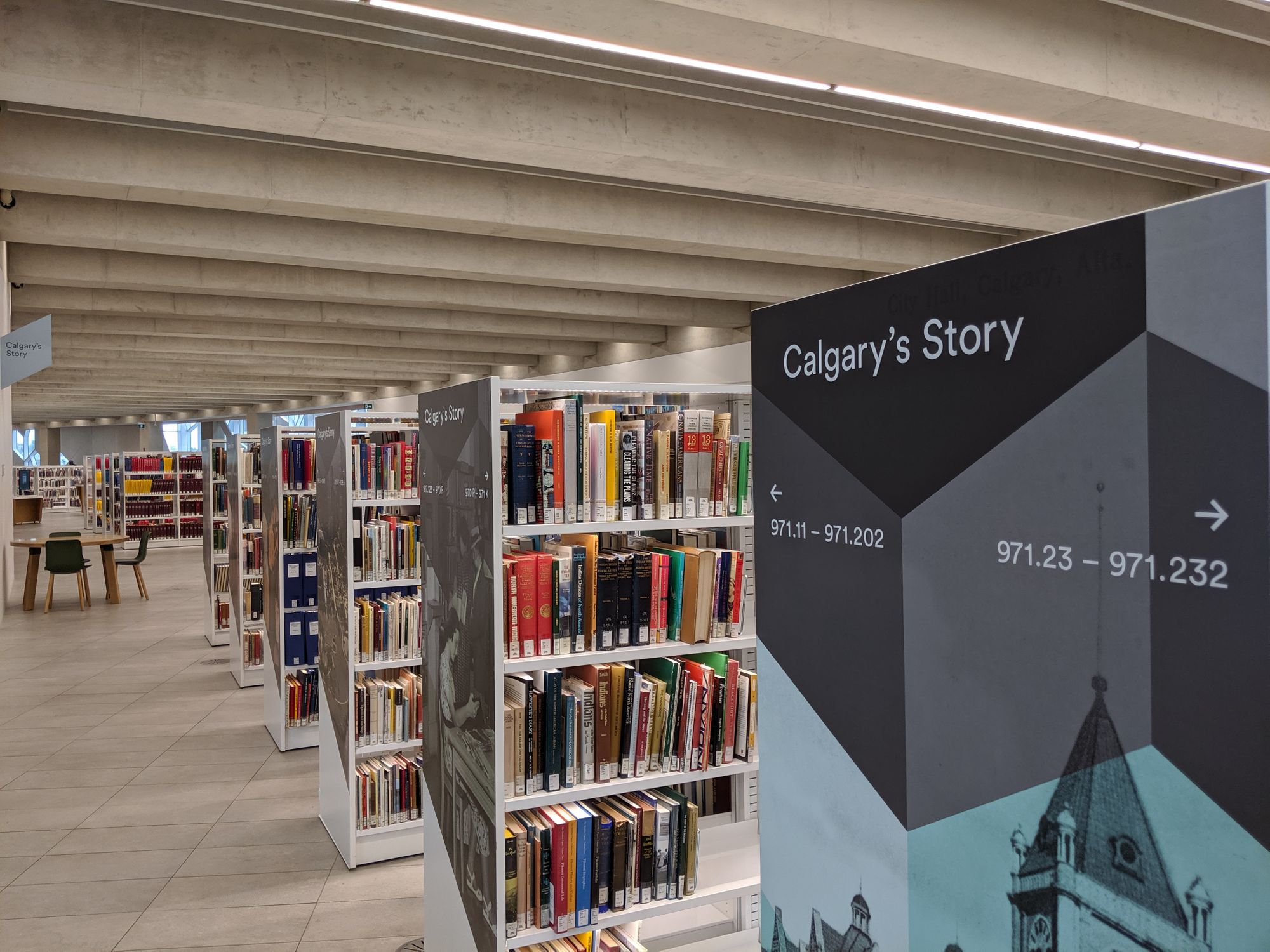
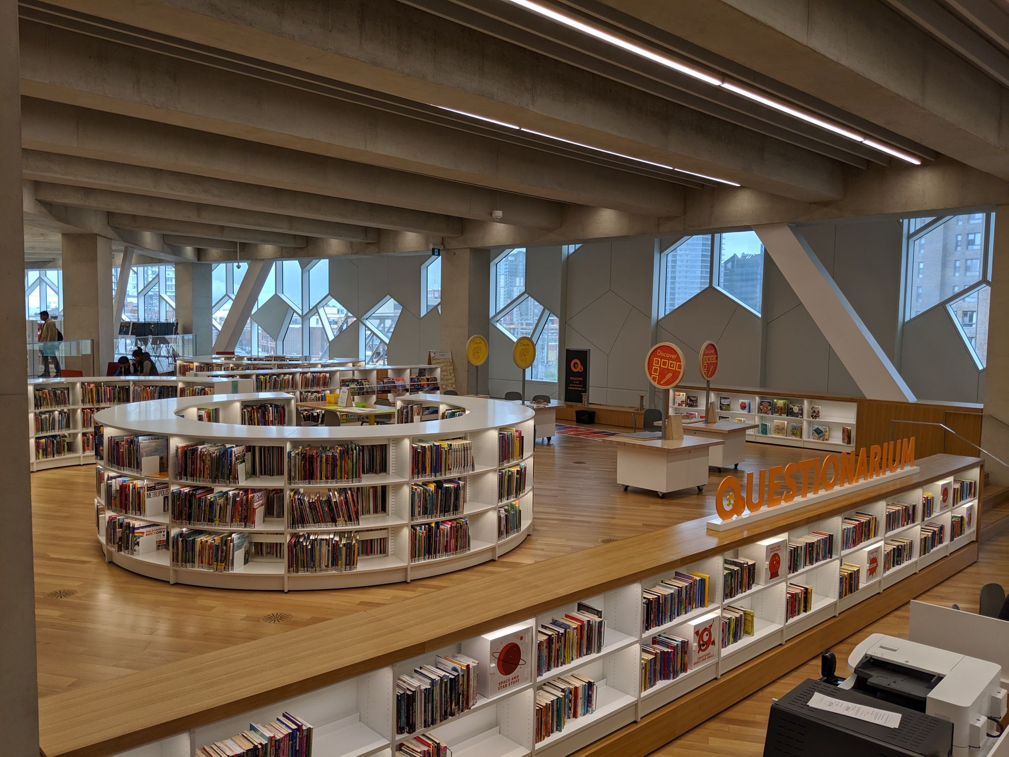
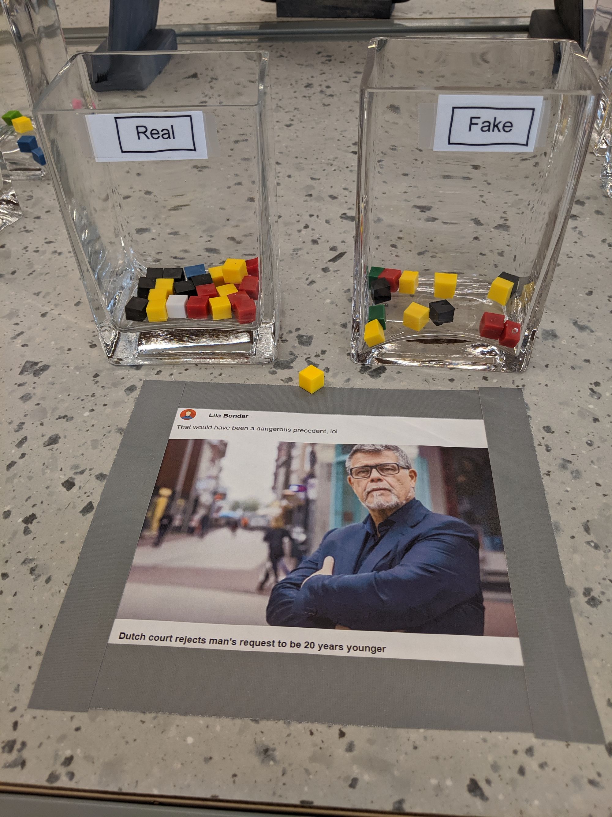
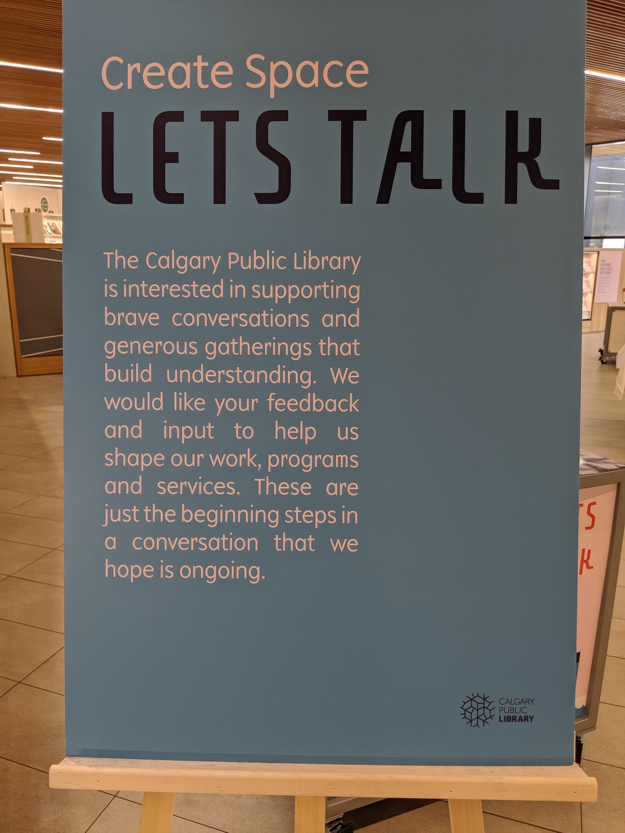
Picture: I took the pictures during a visit to the library, 10 September 2019.
Provenance: I originally published this post on 11 September, 2019, on Facebook. Slightly adapted here.

