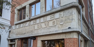
I have become increasingly interested in fonts over the last couple of years, exploring something of the history as well as the enormous volume and variety of current activity. I will post an occasional note about them here, acknowledging my amateur status. The fonts on this entry are from two sources, each with an intriguing and significant story that speaks to diversity and its lack.
Ange Degheest
First, the body text and quotations set in fonts from a collection of typefaces by Ange Degheest, a fictional designer wonderfully realised by students at The European Academy of Art in Brittany. Read more here. They were highlighting how female type designers where either hidden or absent from the record. The body is in Latitude, and the quotations are in Abordage, both by Eugénie Bidaut. The fonts are distributed together in one download on Velvetyne, the wonderful site for open source fonts.
Eugénie Bidaut, one of the former students, says, “Type design history is very masculine. In the history of midcentury French type design, there is only one woman, Lucette Girard, who collaborated with Adrian Frutiger and other male designers. We were searching for someone to identify with, and were not interested in doing a revival of the work of an old white man, so we decided to invent a person who was missing.” // Meet Ange Degheest, Pioneering 20th-Century Female Type Designer, AIGA Eye on Design, Angela Riechers
It was after reading this that I came across Alice Savoie's Lucette typeface. Alice Savoie contributes an afterword to a pamphlet on Ange Degheest.
More from Eugénie Bidaut here. Especially interesting for French speakers/readers may be Adelphe.
Soyuz Grotesk
Indeed, for a New York designer in 1980 the Swiss Style must have seemed universal and omnipresent — the typographic modernism was an already well-established practice with decades of history. In most other parts of the world, though, the situation was largely different. // Soyuz Grotesk, Roman Gornitsky
The heading, navigation and button text are in Soyuz Grotesk by Roman Gornitsky of The Temporary State. It is an adaptation back into Latin of a Russian adaptation of Helvetica. The conceit here is that it is done as if without knowledge of the original Helvetica, or of the Latin practices of which it is a part. I love the 'r' in this context. Read more here and here. It has only one case, a reminder that upper and lower case are not universal.
Rarely a typeface comes as a reflection of some current situation—usually it is in the consideration of the past or imaginary future. // Roman Gornitsky in interview with Brian Huddlestone, The Gradient
For a review of Wremena, a Times-like font by The Temporary State which is also freely available see Pimp My Type.
Note: Title phrase from Louis MacNeice's Snow.


