Glanceability is about enabling “users to understand information with low cognitive effort”. And further:
Glanceability refers to how quickly and easily the visual design conveys information after the user is paying attention to the display.
These quotes are from a paper Designing glanceable peripheral displays by Matthews, Forlizzi and Rohrbach at Berkeley. [abstract html] [full text pdf].
I went looking for further information about glanceability after I came across a mention of it in Tony Hirst’s blog:
However, whilst the visual component to radio is not just using limited to scrolling liveText displays, nor does it mean moving wholesale into television: the key is to support glanceability, a beautifully evocative word referring to the ability to look at a screen and capture the information you require at a glance. [OUseful Info: Learnin’ from Virgin]
Broadly speaking, it seems to me that effective ranking, for example, supports glanceability, as folks will focus in on top results and may forego individually inspecting each member of a result set. And of course, one of the issues with library websites is that they have low glanceability: they require quite a bit of cognitive effort to figure out what is available where as they present a thin guiding layer wrapped around a resource fragmented by legacy categories.
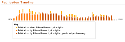
I like the visual features of Worldcat Identities, the timeline and audience level indicator. Each of these provides a hint about a resource, something that conveys quite a bit of information but which requires low cognitive effort to assimilate.
The timeline gives a nice sense of shifts in reputation or reception of an author over time. Here for example is the timeline of the very popular victorian novelist Edward Bulwer-Lytton [wikipedia entry]

Although, there is a decline in volume there continues to be interest in re-issuing his novels and some writing about them. One thought is that this may be because of ongoing academic interest. A glance at the audience level indicator supports this ….

[For info on audience level see the project page.]
Related entries:


