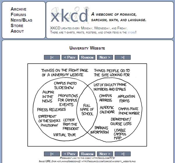
The following graphic was noted in a variety of places recently. It clearly struck a chord!

My own bugbear on library websites is physical address (I sometimes want to know where the library is) and director or staff contacts (which are sometimes really quite hard to find!).
This reminded me of a couple of websites which try to address this issue. In each case, the site is using ‘intentional‘ or usage data to try and save the time of website users.
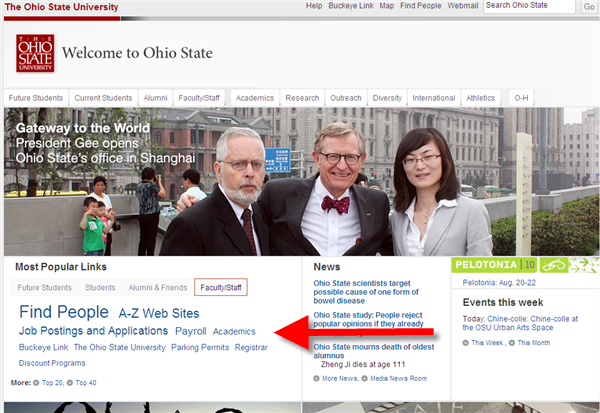
I like the cloud of menu items under the tabs on the home page of our neighbors, Ohio State University. I have clicked the faculty/staff tab. I was interested to see the link to parking permits!

The other is the creation of a cloud of tags based on Delicious bookmarks on pages on the University of Southampton. This is an interesting idea, although looking at the Delicious pages it appears that it may have been too far ahead of actual practice?

Share
More from LorcanDempsey.net


