I spent a couple of hours in Heffer’s in Cambridge a while ago. Turning a corner I was pleasantly surprised by a set of handsome books in fine covers especially set out for inspection. It turned out they were a special issue to mark the 30 year anniversary of the Virago Modern Classics.

2008 is the 30th anniversary of the Virago Modern Classics. To celebrate this occasion, we’ve produced a stunning set of eight hardbacks, featuring cover artwork by twentieth-century women textile designers, including Lucienne Day, Cath Kidston, Orla Kiely, Celia Birtwell, and founder of Biba, Barbara Hulanicki. This stylish collection, celebrating literature and art by women in the twentieth century even featured in the Sunday Times style barometer (going up, of course). [Virago Modern Classics – Little, Brown Book group]
I do not know the background here, or the history of Virago in recent years. And certainly, that last sentence seems out of synch with its founding ethos. The iconic green covers loom large in my book memory.
I consulted my colleagues, my fixation reaching such a degree that poor Harriet tells of me pinning our designer to the wall, demanding five colour covers, exquisite paper, washed tops, strings, and every production frill for my beloved new idea. Penguin used a serious male thinker – Isaac Newton? – to advertise their classics. The Virago Modern Classics list was meant to be more ebullient, a library of women’s fiction with Boadicea rather than Newton waving the flag. I chose green because it was neither blue for a boy nor pink for a girl. I saw in my mind rows of green paperbacks with luscious covers on all the bookshelves of the world. [Carmen Callil on Virago Modern Classics | Books | The Guardian]
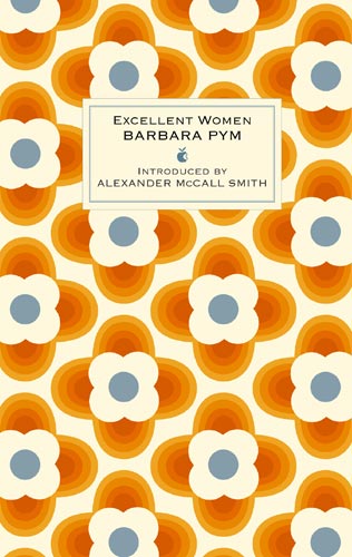 I immediately bought the Barbara Pym from the anniversary set. Barbara Pym is being read in our house at the moment and Orla Kiely, a focus of our daughter’s unfulfilled consumer interest for a while, designed the cover. It is a nice object to own.
Near these books was a selection from the publisher Persephone Books, and seeing them close by like that I wondered if the Persephone approach had influenced the Virago anniversary editions.
We have given much thought not only to the choice of titles we will publish but also to ‘what women want’. Our books look beautiful because we believe that, whether they are on an office desk, by the Aga, or hanging in a bag over the handles of a buggy, it is important to get pleasure from how they look and feel….
…Fabrics are as much a part of our daily lives as furnishing and dress materials, yet we rarely see them used in any other context. However, fabric design should be celebrated for its own sake; and because it is a field in which women designers have been particularly prominent we would like to use their work whenever possible. [Persephone Books, rediscovered twentieth century novels, neglected women writers, twentieth century female authors, out of print books, inter-war novels]
Also on display in Heffer’s was a table full of David Pearson’s Books as History which I mentioned in these pages a while ago. His theme, I suggested, was that artifactual properties of books have historic, aesthetic or other interest independent of the texts they convey. Appropriately enough, then, you could buy a signed copy of the book.
 In recent months, since reading David’s book, I have been more conscious of the physical properties of the books I come across. And wandering around Heffer’s, I did wonder if there was an increased focus on interesting covers or formats for some publishers, of which the Virago and Persephone books were striking examples.
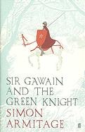
In fact, I nearly bought Simon Armitage’s translation of Sir Gawain and the Green Knight because it looked very nice, and had to hurry out of the shop before I got carried away.
Related entries:

