Drawn by a Tweet I looked at Stanford's very nice new library website just now. I only spent a few minutes there but I was immediately and strongly struck by two things. Each makes so much sense that I imagine they will become routine.
The first was the foregrounding of library space as a service. The second was what I might call full library discovery, the ability to discover the full capacity of the library, not just the collections, with a single search.
Library space as a service
A shift is underway in library space, from being configured around collections to being configured around research, learning and related social behaviors. In this way, space is an important aspect of how a library engages with its users; it is a service in itself, not only part of the infrastructure to manage collections.
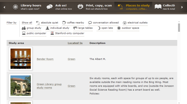
This is recognized here in that two of the elements in the nice central navigation strip are about space, Library hours and Places to study.
If you look at Library hours, it tells you what is open now, as you look at it. It is not just a static list of times and locations.
If you look at the Places to study tab it opens out interestingly to allow you to filter by your requirement – for individual study, for quiet, for group study, for particular facilities, and so on.
From full collection to full library discovery
There has been a major focus on integrated discovery services in recent years, with the model of a cloud-based, central index over catalog, article and related data becoming common. The goal has been ‘full collection discovery’ delivered in a single search box.
We are now seeing an extension of this ambition to cover ‘full library’ discovery where services, staff profiles and expertise, or other aspects of library provision are made discoverable alongside, and in the same search environment, as the collections.
I have written before about the University of Michigan site, which is a good example. It works well to project the library on the web as a unified service. A central part of this is the integrated search over collections, library website, LibGuides and library staff profiles. The return of relevant subject specialists which match the query in a separate results pane is particularly interesting. And is in line with my view that if libraries wish to be seen as expert, then their expertise must be visible.
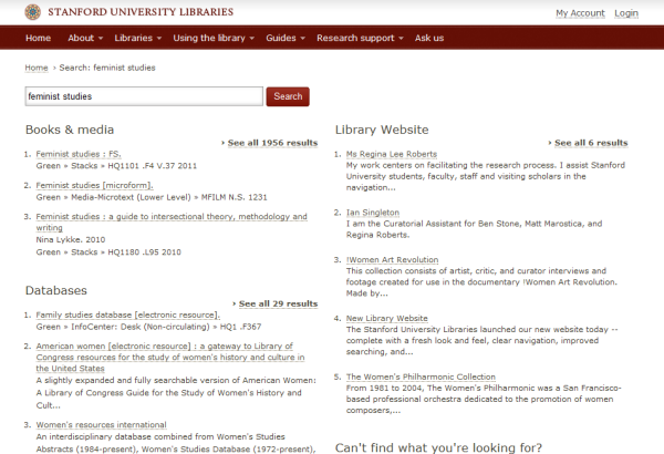
The Stanford site offers a Search everything tab, with this amplifying tagline: “Not sure where to start? Try this.”. What I like about it is that the examples searches shown emphasise the ‘full library’ aspect of what is on offer here: they are very deliberately pitching this at a broader level than books and articles. The example searches are ‘renew books, dissertations, feminist studies, worldcat’: they are about questions people may have when they come to the library website, not only about items they might find in the collection.
Now, in practice results work better sometimes than others, but the general principle is good and you can see how it can be improved over time. In an accompanying blog description, Chris Bourg repeats Feminist studies as an example. Note the the staff profile pages returned in the library website search.
As libraries move in this direction, several trends are apparent. One is the use of Drupal, Blacklight and other ‘container’ frameworks to deliver unified services. A second is a rethinking of how services, staff profiles and expertise, and other library activities are represented and indexed. The increased use of resource guides – in many cases Libguides – is one aspect of this, in particular as they are used as a simple content management framework for various type of information about the library, and not only for lists of information resources. Another is the ‘Bento box‘ style results, as not only may it be difficult or confusing to rank results across different types of resources, but a tabular presentation like this may make more sense to users.
For more information about Stanford design decisions and ambitions see the justifiably proud blog entries by Chris Bourg.
Related entries:


